Jun
22
2011
--

EyeTrackUX 2011 – London

I sneaked out of a very busy SimpleUsability office in Leeds to attend the annual eye tracking user experience conference organised by Tobii. This year saw it hosted in London, which was a bit of contrast to some of the more glamorous locations of previous years. I do hope it’s held in a more desirable and warmer surroundings next year, such as Barcelona – which seemed a popular suggestion from the attendees I polled.

I attended once again as a speaker; and also took a seat on the expert panel. I’m not going to blog about every presentation – just the two that left me smiling the most.

The conference launched with a fabulous keynote from Aga Bojko, “Fluffy Bunnies or Research Apocalypse?”

Aga expertly used Prezi to get her message across about where eye tracking was heading and who was entering the market. I was pleased to finally get some data on webcam eye tracking, which suggested

  • only 55% of a sample would provide valid data for analysis,
  • systems offered 1 to 5 degrees of accuracy from a stationary head (5 degrees is a massive issue)
  • a hugely variable sample rate of 5 to 30Hz.

Overall this means webcam eye tracking is only detecting approximate gaze points instead of accurate fixations in sessions of just 5 minutes. No real surprises there, but it was great to hear somebody finally talking detail on this evolving/contentious approach to data collection. Aga then went on to destroy the validity of mouse eye tracking and then bust the myth of visual attention prediction services, like fengui, that people like to tweet about (Some of Aga’s examples are shown here). She rounded off the first half of her talk by asking what eye tracking people are doing about all this stuff, because it has the potential to undermine the quality of work carried out by the people attending the conference.

After a pause, a warmed up Aga proposed that researchers should stop hyping eye tracking and focus on doing actionable research with their eye trackers.  To do this, she started by busting the prevalent myth that 30 users are needed for eye tracking studies. After reminding people where this crazy figure of ’30 users’ came from, Aga recommended that practitioners needed to be more scientific in their approach to choosing sample size, using recognised calculations that take into account problem discoverability and your research aims. Jeff Sauro has a created an online calculator that simply does the maths for you at:

http://www.measuringusability.com/problem_discovery.php

There was a lot more to Aga’s talk than I’ve covered and she finished with an overview of what she meant by making research actionable.

I was impressed and happy; the person writing the book about a topic I feel so passionately about, really gets it and also cares. Huge panic over, I too can now sleep at night. It was a good wake-up call for many in the room and I think a few cages were positively rattled.

My second smiley talk was from Charlotte van Dael, “Eyetracking out there”.

I loved this talk because it was about getting out of the lab to meet users on their ground and the reality of what that actually involves. She shared lots of tips about how you go about conducting studies in the field. SimpleUsability do a mix of lab and field based testing, so much of what Charlotte talked about was familiar. A useful takeaway for me was a suggestion for using wireless transmitters for getting audio into the observation room when off-site.
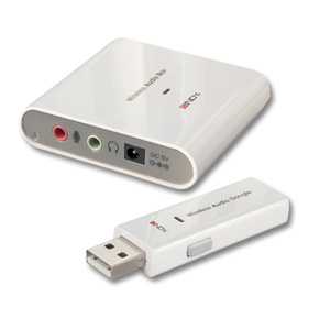
I think what made me smile most was the reaction of the room to this approach – it seemed like it was something that many hadn’t considered or thought was possible. In wrapping up, Charlotte also took the opportunity to give some feedback to Tobii about their product and some requests.

Over the two days, we got the chance to see lots of different approaches, play with new eye tracking accessories and hear about new services. I was disappointed to find out that Tobii are launching an insight service – you can now rent an eye tracker with a Tobii researcher to drive it. Whilst they claim that it’s not in competition with research companies, I feel it’s the thin end of the wedge and a move that will upset customers.  This does mean that Tobii get to ‘eat their own dog food’, and maybe we’ll see some productivity and reliability changes to Tobii Studio based on feedback from Tobii researchers using systems in commercial research.

Tobii also announced their involvement in developing webcam based eye tracking services. This seemed a strange thing to do, as I thought Tobii wasn’t involved in webcam services.

As always at EyeTrackUX, met lots of new people, informally benchmarked our services against peer offerings, had some great conversations and have returned to the office inspired on a number of levels.

I’m already looking forward to (Barcelona) next year.
Written by Guy in: eye tracking | Tags: , , ,
Jun
30
2010
1

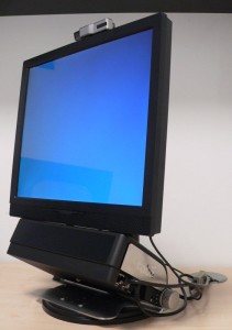
Our Tobii X60 setup at SimpleUsability

When upgrading our Tobii 1750 last year we had to decide between buying an integrated eye tracker such as the T60 or a standalone unit like the X60. Whilst most of our web usability research at SimpleUsability is still carried out on a 17 inch 1024 x 768 display, we’ve increasingly needed to use larger HD displays for print and packaging research. So having a standalone unit which we sat infront of different screens seemed the best option.

The main drawback with the remote eye trackers is when the research participant moves the screen to their prefered distance (as they regularly do in sessions). Because the tracker is not physically attached to the screen, you need to take accurate measurements again so that the software knows where the tracker is in relation to the screen. Taking the measurements is easy – it’s just not conducive to relaxing the user at the begining of a session.

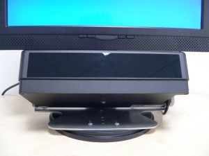
To get around this, we put together a setup that’s easy to unpack and run, without having to measure and the users can move things, and the facilitator can adjust the movements to ensure the screen and Tobii X60 are still aligned. The X60 sits on the monitor stand, so you are free to move the whole unit back and forth to meet the preference of the user. All of the kit goes in a flight case. Setting up just involves lifting the screen to maximum stand height and then placing the X60 underneath so that it’s flush with the bottom of the screen. Just for peace of mind, we use the angle finder iPhone app to make sure the X60 angle is set correctly.

We’ve been asked a few times about our setup – so here are a few photos and notes.

We chose the Iyama P1705S 17 LCD Hard Glass Monitor with adjustable stand. Be careful when ordering, because you need to ensure you’re getting the one with the adjustable stand. The glass screen means we can easily clean off fingerprints and pen marks left by participants.

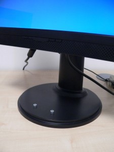
The only modification we made to the stand was to drill two holes to place two socket cap screws for the Tobii X60 to locate on. If you take the metal plate off the base of the stand, there’s room for nuts to hold the bolts in place. I think I spent 3 hours measuring, checking, re-measuring, drawing datum lines, measuring again etc…. then drilling two holes carefully with a pillar drill. Ideally, you want the bolt heads to be in a line parallel to the VESA plate/screen so that the Tobii X60 is central. If you do get it wrong, you can just take measurements to reflect any offset – but having it all central and lined up is best.

The other modification we’ve done is place black vinyl over the logos on both the screen and tracker and led light at the front of the screen, so that there’s no distractions to the user and no “we’re eye tracking you” label on the X60.

If you are planning to copy our setup with a larger monitor, you need to be aware of the angles/range of the tracker. Larger wide screens will mean that the X60 has to be further in front of the monitor to ensure it can track at the extremities of the screen.

Jun
22
2010
2

SimpleUsability lead the field with running first ever consumer retail research project using the new Tobii Eye Tracking Glasses.

Eye tracking glassesObserving the consumer’s subconscious making decisions in supermarkets.

It’s been over two years since we were first told about a top secret product that Tobii’s R&D team were working on; eye tracking glasses with all the technology hidden from the wearer. I think the exact phrase used was “think Oakley’s meet James Bond”.

To date, all of the wearable/head mounted eye tracking equipment that we have experienced has been a bit cumbersome, with invasive head mounted equipment that usually relied on the participant carrying a laptop with them in a rucksack. The new glasses from Tobii change all of this. They are discrete and simple to use.

Tobii confirmed that SimpleUsability is the first company in the world to have used the new system for consumer research, out in the field, conducting shopping research in supermarkets across the UK. The new lightweight system comprises of a pair of trendy looking glasses and a small recording device that’s similar in size to a portable hard drive.

As a business we pride ourselves in conducting eye tracking studies that observe natural behaviour with minimal research effect. Head mounted eye tracking can be quite invasive – either asking the user to wear a cap or glasses with cameras mounted at the front, constantly reminding the user that they are being monitored. We found that research participants were more than happy to wear the glasses, which meant they naturally got on with their shopping.

To date, we’ve run a number of studies studies with the glasses for both actual in-store shopping and simulated in-store, where shoppers walked up and down projected fixture concepts. The SimpleUsability team are exceptionally happy with the system. The participant simply puts the glasses on, we quickly calibrate, press record, then clipped the recorder to their belt or bag and then sent them off to shop. Takes no more than a few minutes.

Once the shoppers returned from their shop, we just took out the memory card and with a few clicks imported the recording into Tobii Studio. It’s so simple. It usually only took a few minutes to import 45 minutes of eye tracking, allowing us to quickly get on with conducting an in-depth review of the  shopping trip with the shopper.

The big advantages this system has over other wearable eye trackers are:

  • Size and weight – it’s really portable and unobtrusive
  • No crazy head gear or cap – shoppers don’t want to wear caps or funny looking technology on their head. The Tobii system is just like wearing glasses and carrying a video iPod.
  • Great workflow – out in the field you need something that just works and makes sense.

We believe this is going to turn consumer research on it’s head. In the short time we’ve been using the glasses, we’ve learned a huge amount of detail about how the subconscious really makes decisions when out shopping. It’s a well known fact that over 60% percent of human behaviour is automatic and we find that eye tracking is the least intrusive way to observe it.

We will write some more articles about the Tobii eye tracking glasses soon and release some footage from our in-store research.

May
02
2009
--

SimpleUsability back from Internet World 2009

To say I’m exhausted, is an understatement. We spent most of this week exhibiting at Internet World 2009, held in Earls Court 2. Three of us manned the stand and were kept busy for much of the time. This was our third show, so we knew the ins and outs of internet world show life.
We had a great time and have already signed up a bigger stand at Internet World 2010.
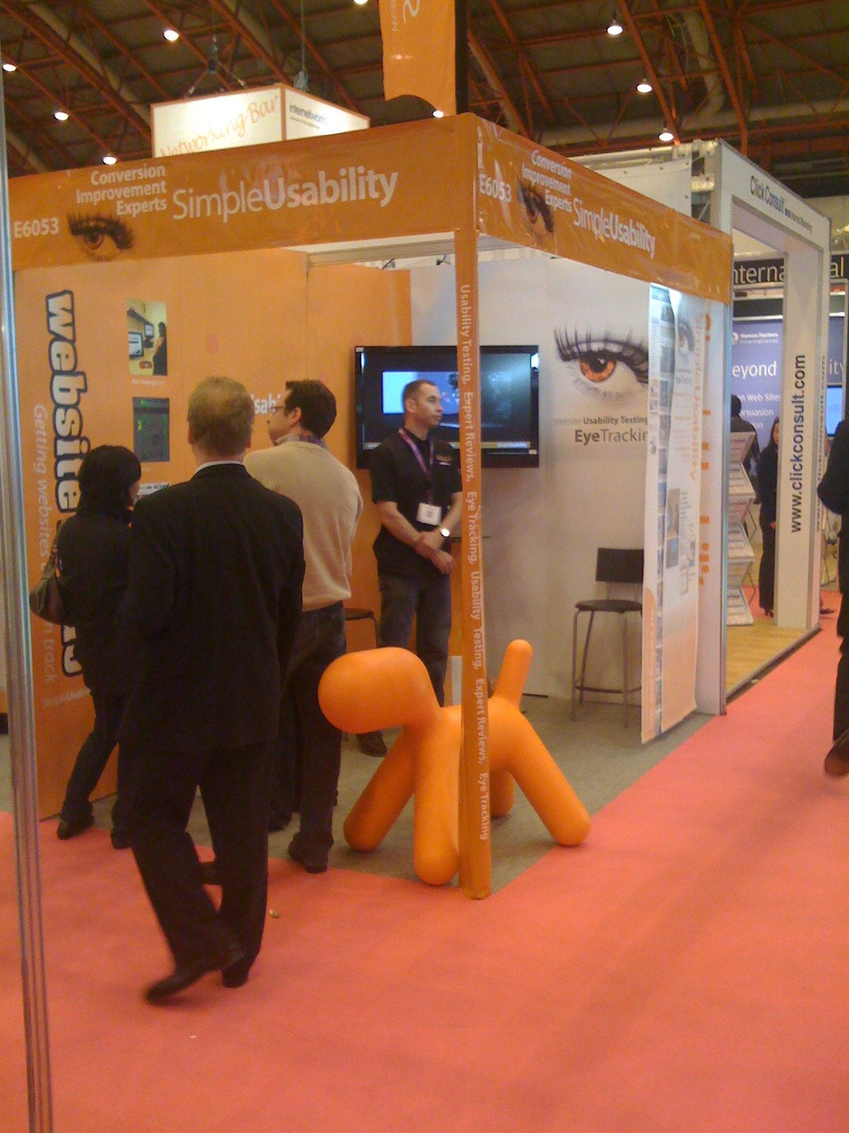
We took the opportunity to trial some new messaging about our offering, and it seemed to work. The big suprise was the orange dog we brought along from the office. Our big plastic dog – Magis Puppy Adult – was a great conversation starter – as well as a handy seat. We also received alot of praise for the 2 meter high eye tracking plots we hung on a curtain rail so that we could pull them out to show the detail we observe with our testing.
The bad news is that 4 days out the office means that this bank holiday weekend will be more of a working catchup weekup weekend.

Written by Guy in: eye tracking,usability |
Dec
04
2008
--

Persuasive Content

Great article about the importance of influential content.
http://www.uxmatters.com/MT/archives/000357.php
1. Talk like a person.
2. Establish credibility.
3. Use the right tone for the brand or situation.
4. Be courteous in your timing and placement of content.
5. Remind customers of differentiators and benefits.
6. Appeal to both the left and the right brain—the rational and the emotional.
7. Tell stories.
8. Consider using metaphors.
9. Avoid cheap tricks.
10. Don’t forget to use images, video, speech, and audio.

Once you’ve done all this, test the effectiveness of your copy through eye tracking.

Written by Guy in: eye tracking,Persuasive Content |
Nov
15
2008
--

Product choosing behaviour exposed through eye tracking

Typical room scene

Typical Big Bathroom Shop room scene

This week, we had a retailer of bathroom suites in for a day of eye tracking. The testing covered a range of customer journeys and a range of bathroom websites. Whilst I can’t disclose all the good stuff we discovered there is a key finding that I’ll share, as we’ve seen it many times before, in other B2C testing and one that may help a few online retailers out there.

As a retailer, you want to display your products in the best possible way, helping your customer choose the most suitable product. Logic tells you that the best way to do this it to have very clear photography of the actual products, helping the user see the differences between them.

Scene showing Wall Stickers from Wallglamour

Scene showing Wall Stickers from Wallglamour

Eye tracking showed us that the users do make initial decisions using the photography and then supporting information like price. We all know that good photography is the cornerstone of a successful online shop. What we saw again in this testing, is that users prefered to chose products that were displayed in room scenes that they liked, over products that were displayed individually. In essence, the users were buying a ‘look’ and not the product, even though the retailer is only supplying the key items displayed, not the total look.

What does this mean to a retailer?
If your product creates a ‘look’, I would recommend conducting some A/B testing to compare the effectiveness of scene photography and component photography. I would also make sure that you have a range of different scenes, so that your products look distinctly different. Displaying different products in the same room scene will not work. You need different products in different room scenes. The down side to this is that if the customer doesn’t like your room scene, they won’t buy the product.

How did we see this?
Eye tracking allows us to see through the users’ eyes and observe their decision process.

Written by Guy in: eye tracking,usability |
Apr
13
2008
--

Internet World – 2 weeks and counting, & hair-loss at an all-time record high.

We’re back at Internet World after a few years of rest, launching a new service aimed at SME website owners who need usability, called Website Rehab. Every business we’ve talked to about this new service, has been very interested. Infact, very, could be an understatement, we’ve had several offers of block bookings, well before rehab is officially launched.

Preparation for exhibitions is pretty stressful – nothing is straight forward, every decision needs 150% of attention and costs just grow. Not only are we running a growing/busy usability business, in the background we’re also having to ensure everything is ordered, designed, agreed and ready for show setup on Monday 28 April.

Jobs left to do include – ordering shirts, caps and jackets with our new livery, chasing the show organisors for an answer over our request to use a flag on our stand, sign off stand design, birth new website & pamphlet to describe the service and finalise the show risk assessment.

We’re also looking at expanding our offices – which may mean another change of address. Early days yet, but be assured, we’re staying in Leeds, and as close to the Cross Keys & Out of the Woods as possible.

Finally. We’re looking for psychology graduates who want to join our team. If you know anybody in Leeds, with a passion for web and behavioural research – please send them our way. We think it’s a dream gig. Only people that share in that thought will join our team.

P.S. We don’t use recruitment companies – so agencies, please don’t waste our time phoning as rejection often offends.

Written by Guy in: eye tracking,usability |
Jul
20
2007
--

Pecha Kucha presentation guide

I’m presenting at the next Geekup in leeds about eye tracking and persuasion centred design Pecha Kucha style. that’s 20 slides, each slide 20 seconds long. Hence finding a nice guide to perfecting 20:20 style.

pecha-kucha-guide-to-better-presentation


Written by Guy in: eye tracking |
Apr
20
2007
--

Eye Tracking User Group Update

The two day Tobii User Meeting in Frankfurt was fantastic. We were hoping it would be special – and can now confirm it was. 60 pioneers of eye tracking for usability studies, sharing stories and ideas over 2 days and much beer.

I’ve got many pages of notes, which I plan to place on here over the next few weeks.

The first thing I’d like to mention in this quick review is that Tobii is a great company with a world class team. It was great to place faces next to email adresses and confirm that they only seem to employ great people. Anne and the team did a first class job with the event and the hospitality was second to none.

The audience had a good blend of academia and commercial usability people. The latter was very strong in their pressence and passion. Our main competitors in the UK had all fielded a person to attend – so we enjoyed putting faces next to the names and learning a little more about the personalities behind the brands.

A few highlights, without too many spoilers:

  1. There was much debate about the correct use of ‘Current Think Aloud’ and ‘Retrospective Think Aloud’ protocols in illiciting feedback from users in testing with eye tracking equipment.
  2. The validity of a study showing ‘F’ pattern findings reported by a famous usability group was questioned by the majority of the attendees. Throughout the 2 days, there were many heckles of ‘I can see an F’ when various heatmaps were presented.
  3. The infamous ‘golden triangle’ found by a different company, also received similar attention.
  4. There was no agreement on a minimum sample size when conducting usability tests with eye tracking.
  5. Testing methodologies need be fluid to match project and customer needs.
  6. The software used for usability testing has a long way to go.
  7. The new Tobii Studio Software – looks very good and very useful.
  8. There is no alternative to a skilled usability practioner when testing.

One of the more memorable moments was watching a video of a Lemur with a head mounted eye tracking unit. Whilst Tobii don’t build head mounted units, it was a fun thing to watch. Study details here and some video here – we had the pleasure of watching live tracking footage. Lemurs like to watch tails and heads… aparently!

Written by Guy in: eye tracking,heatmaps,tobii,usability |
Apr
17
2007
--

First Tobii Eye Tracking User Meeting

We’re heading over to Frankfurt today, to attend the first Tobii Eye Tracking User Meeting. Two days of workshops and collaboration between the companies pioneering the use of non-intrusive eye tracking technology. Aparantly the meeting is full and there’s a waiting list – so we’re quite honoured to be going as a team.

We’re hoping to gleen some extra technniques that will enable us to offer an increased level of emperical analysis to our eye tracking studies. It’s a fast moving market and Tobii will be giving us a preview of there next generation of hardware and software. I’ll see how open the Tobii team are to us taking photos and notes for posting here upon return.

Written by Guy in: eye tracking,tobii,usability |
Apr
14
2007
1

Web session playbacks – look beneath the gloss

A few months ago I was looking for web session playback solutions for a particular project that may have benefited from it and put together the list of technologies at the end of this page. I haven’t played with many of them but have spoken to some vendors and got inside info on the tech. Recording people use your website sounds very cool – but once you ask a few questions about the reality, the gloss begins to dull rather quickly. One of the ideas is that when somebody calls the customer service team and says ‘I tried to place an order on the site but it didn’t work’ you could go back and possibly replay that user trying to place an order and learn how to make the website more useable.

Unfortunately,  there are huge flaws in these technologies and you need to understand that before deciding if they are suitable. In the right situation they are awesome – but unless the vendors find new ways to record – they’re usefulness is increasingly limited.

These technologies work in two ways:

  1. Method 1 – javascript tags placed on a page pass back mouse coordinates and other session info allowing the session to be replayed and analysed. Just like Google Analytics.
  2. Method 2 – a proxy server/packet sniffer that sits on the webserver network storing the packets of data that each user downloads in their session.

It’s interesting to note that many banks use method two to record every interaction with their websites, just as they record your telephone call when you talk to the call centre.

The idea is that you can watch a recording of a person using your website, from a few days ago, and see the mouse move on screen and watch the user scroll etc. Which is great – you get a playback of the flow of a user through your website and that’s it. Some packages will produce heat maps of where the mouse has been on a screen and also where people are clicking.

At this point I feel we need to start educating people in what they are actually getting. There is no beneficial relationship between the position of a mouse and what a user is looking at. In a nice review of TapeFaliure on the Big Green Blog, (go watch the video) Marshall writes:

kinda like a cheap man’s replacement for eye-tracking, if you ask me

This is wrong and unfortunately, many people are starting to believe this. We conduct eye tracking studies all the time and we see no relationship between what a user is looking at, reading, scanning etc, and where the mouse pointer is on the screen. The only time the mouse and eye meet are when they user goes to click on a button/link or scroll without using a wheel mouse.

The second problem with this technology is that Method 1 plays back sessions against the current website – they basically overlay your mouse and screen coordinates over your current website. Most websites change regularly, so playback is possibly only realistic for pages where there is no change, maybe your checkout pages?

The third problem is that these methods struggle to cope with dynamic page scripting which is commonly referred to as AJAX. As more sites move away from ‘pages’ and start to utilise dynamic content, these playbacks also become void – as do the popular approaches to traffic analysis.

There are some privacy concerns with this technology, but your average user is not bothered whilst they remain unaware. We track lots of data through analytics already, but when you mention to people that we could track everything, even your mouse movements, typing etc… they show a new increased level of concern.

Would I use this tech myself in projects?

Yes, indeed. I can see huge benefit in showing heatmaps of mouse clicks on a website. I can also see huge benefit in playing back sessions for customers that have good old fashioned non-ajax reliant websites. But as I mentioned at the start of this post, look beyond the gloss and understand the limitations.

But non of this comes close to the value you get from observing a few ‘real’ users in an eye tracking studio.

List of vendors/products:

  1. Crazy Egg – http://crazyegg.com
  2. TapeFailure – http://www.tapefailure.com
  3. ClickTale – http://www.clicktale.com
  4. ClickDensity – http://www.clickdensity.com/
  5. Tealeaf – http://www.tealeaf.com
  6. Foglight – http://www.quest.com/foglight
  7. Metronome (formerly BeatBox) – http://www.metronomelabs.com

The last 3 are the big tools for those big jobs.

To sum up, this reminds me of the days when I met Interwoven in their early years, pre 2000 I think, when they were getting a lot of interest in their content management system because the sales team had a very sexy demo. They could show you content editing in context – which was amazing. You could show a site owner how they could browse through their website with their browser and at any point click on the edit button and then just change some words. CMS at that point, typically involved geeky administration screens, but the Interwoven Teamsite demo made the system look so easy to use for real users. However, there was a flaw in this approach as this did not work, with data driven sites, where content was pulled from other sources, like databases. Projects found this out when they actually started to implement their CMS – but the demo was so good, people just wanted it.

You need to look beyond the gloss and understand how this technology can help.

Written by Guy in: eye tracking,heatmaps,usability |