May
02
2009
--

SimpleUsability back from Internet World 2009

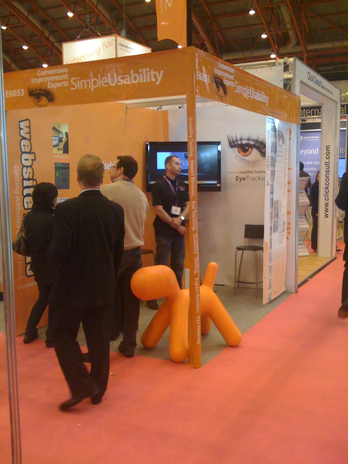
To say I’m exhausted, is an understatement. We spent most of this week exhibiting at Internet World 2009, held in Earls Court 2. Three of us manned the stand and were kept busy for much of the time. This was our third show, so we knew the ins and outs of internet world show life.
We had a great time and have already signed up a bigger stand at Internet World 2010.
We took the opportunity to trial some new messaging about our offering, and it seemed to work. The big suprise was the orange dog we brought along from the office. Our big plastic dog – Magis Puppy Adult – was a great conversation starter – as well as a handy seat. We also received alot of praise for the 2 meter high eye tracking plots we hung on a curtain rail so that we could pull them out to show the detail we observe with our testing.
The bad news is that 4 days out the office means that this bank holiday weekend will be more of a working catchup weekup weekend.

Written by Guy in: eye tracking,usability |
Dec
22
2008
--

Think Visibility – a new conference in Leeds

I’ve been invited to speak at the new Think Visibility conference in Leeds, organised by Dom Hodgson. This conference pulls together a range of respected speakers focusing on online visibility and conversion. If you are involved in etail, this should be a no brainer decision, you’d normally pay big money to see just one of two of these speakers, but Dom, in his usual way, has managed to bring it all under one roof for a nominal fee of £30.
My talk will be centred around customer strategy and how you need to mirror their behaviour to engage. I will have a few interesting props and some eye tracking footage to demonstrate just how brutal users can be.
Think Visibility, Saturday 7th of March 2009 – you’ve got no excuses.

Written by Guy in: conference,seo,usability |
Nov
15
2008
--

Product choosing behaviour exposed through eye tracking

Typical room scene

Typical Big Bathroom Shop room scene

This week, we had a retailer of bathroom suites in for a day of eye tracking. The testing covered a range of customer journeys and a range of bathroom websites. Whilst I can’t disclose all the good stuff we discovered there is a key finding that I’ll share, as we’ve seen it many times before, in other B2C testing and one that may help a few online retailers out there.

As a retailer, you want to display your products in the best possible way, helping your customer choose the most suitable product. Logic tells you that the best way to do this it to have very clear photography of the actual products, helping the user see the differences between them.

Scene showing Wall Stickers from Wallglamour

Scene showing Wall Stickers from Wallglamour

Eye tracking showed us that the users do make initial decisions using the photography and then supporting information like price. We all know that good photography is the cornerstone of a successful online shop. What we saw again in this testing, is that users prefered to chose products that were displayed in room scenes that they liked, over products that were displayed individually. In essence, the users were buying a ‘look’ and not the product, even though the retailer is only supplying the key items displayed, not the total look.

What does this mean to a retailer?
If your product creates a ‘look’, I would recommend conducting some A/B testing to compare the effectiveness of scene photography and component photography. I would also make sure that you have a range of different scenes, so that your products look distinctly different. Displaying different products in the same room scene will not work. You need different products in different room scenes. The down side to this is that if the customer doesn’t like your room scene, they won’t buy the product.

How did we see this?
Eye tracking allows us to see through the users’ eyes and observe their decision process.

Written by Guy in: eye tracking,usability |
Nov
08
2008
--

I want to be a retailer

Whenever our usability business engages with an online retailer who’s got a good proposition, I’m always a little envious of the position they’re in. Online retail is really exciting, the rewards are well earned for those that get it right and the detail people need to do on the customer journeys is big. For brief moments, I start to day dream and think of what I could do with their propositions… working 365 days a year, fulltime on a good retail site would be so much fun. Infact, as much fun as running an eye tracking company.

I have a few ideas on ways to help a few lucky retailers in an unconventional manner and will hopefully blog about it soon.

Written by Guy in: usability | Tags: ,
May
20
2008
--

Top 8 usability mistakes

All I’m going to say is…. this is fabulous… please nobody shout at me.

http://goodexperience.com/2008/05/the-top-8-mistakes-in.php


Written by Guy in: usability |
Apr
13
2008
--

Internet World – 2 weeks and counting, & hair-loss at an all-time record high.

We’re back at Internet World after a few years of rest, launching a new service aimed at SME website owners who need usability, called Website Rehab. Every business we’ve talked to about this new service, has been very interested. Infact, very, could be an understatement, we’ve had several offers of block bookings, well before rehab is officially launched.

Preparation for exhibitions is pretty stressful – nothing is straight forward, every decision needs 150% of attention and costs just grow. Not only are we running a growing/busy usability business, in the background we’re also having to ensure everything is ordered, designed, agreed and ready for show setup on Monday 28 April.

Jobs left to do include – ordering shirts, caps and jackets with our new livery, chasing the show organisors for an answer over our request to use a flag on our stand, sign off stand design, birth new website & pamphlet to describe the service and finalise the show risk assessment.

We’re also looking at expanding our offices – which may mean another change of address. Early days yet, but be assured, we’re staying in Leeds, and as close to the Cross Keys & Out of the Woods as possible.

Finally. We’re looking for psychology graduates who want to join our team. If you know anybody in Leeds, with a passion for web and behavioural research – please send them our way. We think it’s a dream gig. Only people that share in that thought will join our team.

P.S. We don’t use recruitment companies – so agencies, please don’t waste our time phoning as rejection often offends.

Written by Guy in: eye tracking,usability |
Mar
05
2008
--

Grace under pressure – a new usability testing technique

We returned from a meeting today, where we had showed off a customer’s website. Unknown to us, it had just been revised to fix an internal shopping cart bug. Anyway – the implemented solution to this bug, was, shall we say, interesting…. and now something we thought may be a new barrier to a sale for some users. 

So we got back to the office and I played a little more with the new feature.

As a business, we’re always open to new website/process concepts and I wanted to test it.

Test it quickly and get some quick feedback.

05 March 2008 2:33pm – we stumbled upon a new (to me) technique for extreme usability testing.

I asked a member of the team, who was busy but could spare a few minutes, to go to this website. I told them to carry out a task in a manner that put them under a bit of pressure. The user failed. I turned up the pressure a bit more and repeated the request. To which they failed again. It took at least four attempts before they realised what was going on and then successfully completed the task.

It was all a bit tongue-in-cheek, but the feedback was extremely useful.

Under pressure, the user, we’ll call Grace, failed spectacularly. The aspect of pressure induced an almost extreme reaction to the system highlighting that this new feature has some usability issues worth exploring.

Sometimes you don’t have time to recruit a structured sample group for testing. Sometimes you need a quick way of finding out if you need to explore an issue further. Putting Grace under pressure, illustrated that there was an issue – an issue that now bumps another impending bug fix higher on the priority ladder.

Grace, I apologise now, for putting you under pressure. Signals was always the better album.

Written by Guy in: usability |
Oct
28
2007
--

Logo Creep TM

A fine example of a behaviour called Logo Creep TM. I thought this was extinct – but it seems the team at Crocus have done their bit to keep it alive.

On a serious note – we have evidence from eye tracking and verbal feedback to suggest that this really annoys users.

Written by Guy in: usability |
Apr
23
2007
--

Xtracycle in the UK – helping Eco & Sustainable Companies

xtracycle carrying a surf boardI finally got time to respond to our latest request for help under our Eco support scheme. The UK distributor of the fabulous Xtracycle has pitched us for some free mentoring. Can we refuse to help such a cool product? There are certain criterias that need to be met and we do have to turn companies away as we can only help 12 in 12 months. Lets see where we go.

After looking at yet more info about the amazing xtracycle – I came across this fabulous video that really sums up the product for one particular niche. (note the awesome Stoke Monkey fitted). You only ‘get’ this video if you know that you’re looking at an xtracycle.

The interesting question surrounding this product is; In the UK, do you market it at the stereotypical audience depicted in this movie or a different audience that may react badly to that association?

Written by Guy in: eco,fair trade,mentor,usability |
Apr
20
2007
--

Eye Tracking User Group Update

The two day Tobii User Meeting in Frankfurt was fantastic. We were hoping it would be special – and can now confirm it was. 60 pioneers of eye tracking for usability studies, sharing stories and ideas over 2 days and much beer.

I’ve got many pages of notes, which I plan to place on here over the next few weeks.

The first thing I’d like to mention in this quick review is that Tobii is a great company with a world class team. It was great to place faces next to email adresses and confirm that they only seem to employ great people. Anne and the team did a first class job with the event and the hospitality was second to none.

The audience had a good blend of academia and commercial usability people. The latter was very strong in their pressence and passion. Our main competitors in the UK had all fielded a person to attend – so we enjoyed putting faces next to the names and learning a little more about the personalities behind the brands.

A few highlights, without too many spoilers:

  1. There was much debate about the correct use of ‘Current Think Aloud’ and ‘Retrospective Think Aloud’ protocols in illiciting feedback from users in testing with eye tracking equipment.
  2. The validity of a study showing ‘F’ pattern findings reported by a famous usability group was questioned by the majority of the attendees. Throughout the 2 days, there were many heckles of ‘I can see an F’ when various heatmaps were presented.
  3. The infamous ‘golden triangle’ found by a different company, also received similar attention.
  4. There was no agreement on a minimum sample size when conducting usability tests with eye tracking.
  5. Testing methodologies need be fluid to match project and customer needs.
  6. The software used for usability testing has a long way to go.
  7. The new Tobii Studio Software – looks very good and very useful.
  8. There is no alternative to a skilled usability practioner when testing.

One of the more memorable moments was watching a video of a Lemur with a head mounted eye tracking unit. Whilst Tobii don’t build head mounted units, it was a fun thing to watch. Study details here and some video here – we had the pleasure of watching live tracking footage. Lemurs like to watch tails and heads… aparently!

Written by Guy in: eye tracking,heatmaps,tobii,usability |
Apr
17
2007
--

First Tobii Eye Tracking User Meeting

We’re heading over to Frankfurt today, to attend the first Tobii Eye Tracking User Meeting. Two days of workshops and collaboration between the companies pioneering the use of non-intrusive eye tracking technology. Aparantly the meeting is full and there’s a waiting list – so we’re quite honoured to be going as a team.

We’re hoping to gleen some extra technniques that will enable us to offer an increased level of emperical analysis to our eye tracking studies. It’s a fast moving market and Tobii will be giving us a preview of there next generation of hardware and software. I’ll see how open the Tobii team are to us taking photos and notes for posting here upon return.

Written by Guy in: eye tracking,tobii,usability |
Apr
14
2007
1

Web session playbacks – look beneath the gloss

A few months ago I was looking for web session playback solutions for a particular project that may have benefited from it and put together the list of technologies at the end of this page. I haven’t played with many of them but have spoken to some vendors and got inside info on the tech. Recording people use your website sounds very cool – but once you ask a few questions about the reality, the gloss begins to dull rather quickly. One of the ideas is that when somebody calls the customer service team and says ‘I tried to place an order on the site but it didn’t work’ you could go back and possibly replay that user trying to place an order and learn how to make the website more useable.

Unfortunately,  there are huge flaws in these technologies and you need to understand that before deciding if they are suitable. In the right situation they are awesome – but unless the vendors find new ways to record – they’re usefulness is increasingly limited.

These technologies work in two ways:

  1. Method 1 – javascript tags placed on a page pass back mouse coordinates and other session info allowing the session to be replayed and analysed. Just like Google Analytics.
  2. Method 2 – a proxy server/packet sniffer that sits on the webserver network storing the packets of data that each user downloads in their session.

It’s interesting to note that many banks use method two to record every interaction with their websites, just as they record your telephone call when you talk to the call centre.

The idea is that you can watch a recording of a person using your website, from a few days ago, and see the mouse move on screen and watch the user scroll etc. Which is great – you get a playback of the flow of a user through your website and that’s it. Some packages will produce heat maps of where the mouse has been on a screen and also where people are clicking.

At this point I feel we need to start educating people in what they are actually getting. There is no beneficial relationship between the position of a mouse and what a user is looking at. In a nice review of TapeFaliure on the Big Green Blog, (go watch the video) Marshall writes:

kinda like a cheap man’s replacement for eye-tracking, if you ask me

This is wrong and unfortunately, many people are starting to believe this. We conduct eye tracking studies all the time and we see no relationship between what a user is looking at, reading, scanning etc, and where the mouse pointer is on the screen. The only time the mouse and eye meet are when they user goes to click on a button/link or scroll without using a wheel mouse.

The second problem with this technology is that Method 1 plays back sessions against the current website – they basically overlay your mouse and screen coordinates over your current website. Most websites change regularly, so playback is possibly only realistic for pages where there is no change, maybe your checkout pages?

The third problem is that these methods struggle to cope with dynamic page scripting which is commonly referred to as AJAX. As more sites move away from ‘pages’ and start to utilise dynamic content, these playbacks also become void – as do the popular approaches to traffic analysis.

There are some privacy concerns with this technology, but your average user is not bothered whilst they remain unaware. We track lots of data through analytics already, but when you mention to people that we could track everything, even your mouse movements, typing etc… they show a new increased level of concern.

Would I use this tech myself in projects?

Yes, indeed. I can see huge benefit in showing heatmaps of mouse clicks on a website. I can also see huge benefit in playing back sessions for customers that have good old fashioned non-ajax reliant websites. But as I mentioned at the start of this post, look beyond the gloss and understand the limitations.

But non of this comes close to the value you get from observing a few ‘real’ users in an eye tracking studio.

List of vendors/products:

  1. Crazy Egg – http://crazyegg.com
  2. TapeFailure – http://www.tapefailure.com
  3. ClickTale – http://www.clicktale.com
  4. ClickDensity – http://www.clickdensity.com/
  5. Tealeaf – http://www.tealeaf.com
  6. Foglight – http://www.quest.com/foglight
  7. Metronome (formerly BeatBox) – http://www.metronomelabs.com

The last 3 are the big tools for those big jobs.

To sum up, this reminds me of the days when I met Interwoven in their early years, pre 2000 I think, when they were getting a lot of interest in their content management system because the sales team had a very sexy demo. They could show you content editing in context – which was amazing. You could show a site owner how they could browse through their website with their browser and at any point click on the edit button and then just change some words. CMS at that point, typically involved geeky administration screens, but the Interwoven Teamsite demo made the system look so easy to use for real users. However, there was a flaw in this approach as this did not work, with data driven sites, where content was pulled from other sources, like databases. Projects found this out when they actually started to implement their CMS – but the demo was so good, people just wanted it.

You need to look beyond the gloss and understand how this technology can help.
Written by Guy in: eye tracking,heatmaps,usability |
Mar
27
2007
--

Designs to inspire and guide

50 Beautiful CSS-Based Web-Designs in 2006 | Smashing Magazine

A simple collection of some pretty site desgins. Something to use when poking a client for some guidance on taste and direction. Also some great examples of shocking usability – but that’s all par for the course.

Written by Guy in: Cosmic,usability |
Mar
14
2007
--

Helping Eco & Fair Trade Businesses

We’re about  4 months into our ambitious pledge to help 12 eco aware businesses for free and I thought it was time to give you an update and get this blog back up and focused. It’s been a huge success – the world is much better place for our help. Ed would be very proud of the karma oozing out of our new offices in Leeds.

Emma, Eco Child and GuyThe first business that signed up and seeded the whole idea is doing exceptionally well from our help. Makes a Change, the organic baby clothing boutique, has seen traffic rise and now has analytics to start honing the whole venture. There’s plenty in the pipeline for this business and I won’t steal Emma’s thunder by spilling the beans here. We essentially mentored Emma in the art of being even more remarkable and SEO. As you can see from the site – Emma totally ‘gets’ it! and this is just the tip of the ice berg.

The next business to sign up was/is more of a longer haul. Positive Planet is a business that provides solar water heating systems that are made for our UK weather. The seals on the system don’t break and you still get super hot water on a dull winter’s day. We haven’t scratched the surface with this one and to be honest, holidays and office moves have not done this project justice. watch this space – as they say.

Then we met Lucy at Tam & Rob – the stylish Fairtrade and organic womens clothing company. They have just launched their revamped website with a new collection of clothing. We held a workshop with Lucy in January, where we went through the whole user centred design process to structure the new website. The new website is a product of the mentoring process. Granted there’s a lot still a lot to do, but it’s all part of big journey and the new site is a foundation for great things.

Next month we have Walk It in the office. That’s a day at the white board to discuss where we can help most. They have huge plans – so lets see where we can take them.

One of the best bits about mentoring the eco companies is that the people behind the businesses are totally immersed in the ethics and detail that make up their offering. We love listening to the stories behind the businesses and the debates over what aspects are important to the business, to the consumer and to the planet. It’s a complex mix and that’s where we focus our support. 

Written by Guy in: Cosmic,eco,mentor,sustainability,usability |